Transalis
Product UI Design Suite
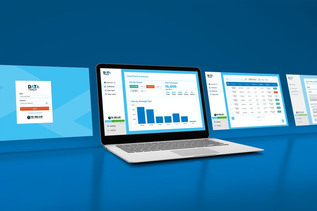
Earlier this year, I completed a UI/UX design course to deepen my digital design expertise. At Transalis, all of our products are delivered online, but until now, they had been developed without the support of a dedicated UI designer.
We are currently in the process of building out complete user workflows for each product. Shown here is an example from DataTrack, where I designed the full user flow in Adobe XD. This prototype is now actively used by our sales team to demonstrate how the product works to prospective customers.
Following the course, I was tasked with working closely with our development team to apply my new knowledge, alongside our refreshed brand assets, to create a more visually appealing and accessible suite of products.
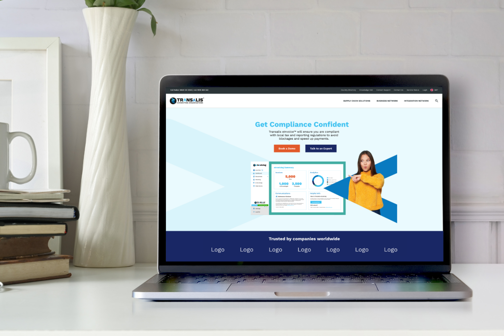
Transalis
PPC Landing Page
At Transalis, I supported the delivery of multiple PPC campaigns by designing engaging, high-converting landing pages. This wireframe showcases a concept I developed to push the boundaries of our existing brand guidelines, introducing a more dynamic and visually compelling layout to improve user engagement and drive conversions.
Transalis
Email Design
As part of a brand guidelines refresh, I was tasked with creating a suite of rebranded email templates. This example showcases our updated newsletter layout, designed with a bold background colour to stand out from our standard plain-text communications. I incorporated cut-out imagery to create visual separation between sections and enhance overall engagement. All email designs were created, built, and tested in Figma to ensure consistency and responsiveness across devices.
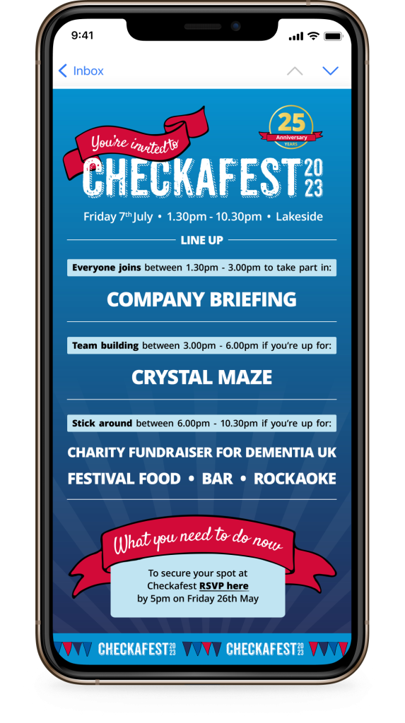
Checkatrade
Email Design
At Checkatrade, celebrating team culture through corporate events was a key part of the internal brand. For the 2023 edition of Checkafest, I was tasked with creating a fresh new visual identity that captured a festival-inspired theme while staying true to the Checkatrade brand.
I created a series of custom digital illustrations to give the event a unique and cohesive look. Working closely with the Head of Internal Relations and the Head of People, I developed a range of email assets to support the event, from the “Save the Date” to the full event itinerary.
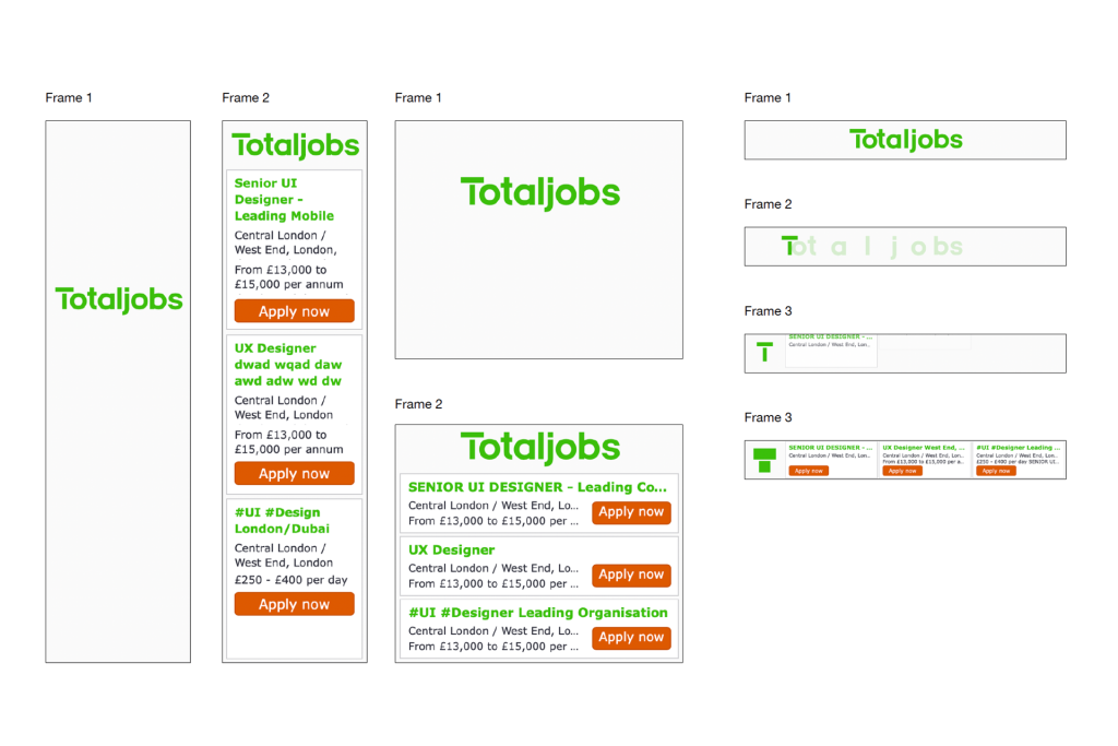
Totaljobs
Display Ad Banners
Following a rebrand at Totaljobs, one of my key responsibilities was updating the visual identity across all HTML5 digital display banners. I reworked the existing code and animations to ensure the updated logo and typography rendered consistently across all standard banner sizes and devices, maintaining brand integrity and optimising for performance.
Minted box
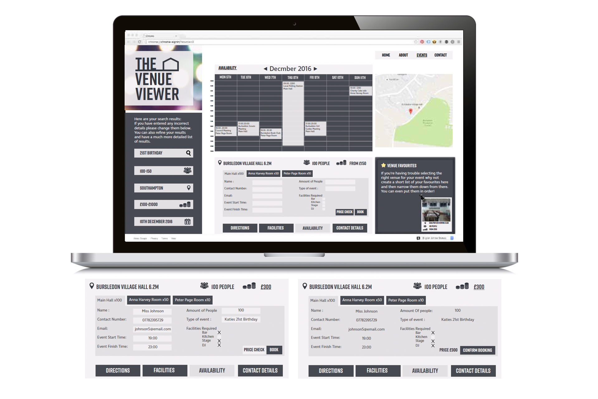
The Venue Viewer
The Venue Viewer website is designed to simplify the process of booking event venues by allowing users to search a comprehensive database based on their specific requirements. While the initial website design was completed by a colleague, I was tasked with designing the customer journey, illustrating the end-to-end experience of how a user would navigate the platform to successfully book a venue.